Devotional from Pastor Dave September 7, 2023
A couple of Sundays ago, our Church Council approved a new logo for our church. This has been something we have been exploring for several months. As we’ve been emerging out of the pandemic, there’s been a sense that this is a fresh start, a season of new beginnings for the church, and so some fresh branding with a new logo seemed appropriate.
One older logo of the church, for which we still have stationery in the office, includes a tagline that reads “Meeting Needs.” While we certainly hope the church meets all kinds of needs in people’s lives, this doesn’t seem to set the church apart from a social service agency.
The most recent logo simply has the church’s name with the United Methodist Church’s cross and flame symbol, and underneath are the words “Engage, Equip, Empower.” Again, this is an “E”-sy tagline to remember, and I preached on those very words my first few Sundays as the pastor here, but it’s also the tagline for the Fellowship of Christian Athletes. Is there something uniquely and identifiably Signal Crest?
We happen to have an advertising expert in our congregation, Bob Waller, who has designed logos for our church’s annual stewardship campaigns. He presented a variety of possibilities, many of which incorporated the recognizable slope of our main sanctuary. Others resembled the WiFi symbol, to go along with my idea of our hope of our church “signaling” Christ in our community.
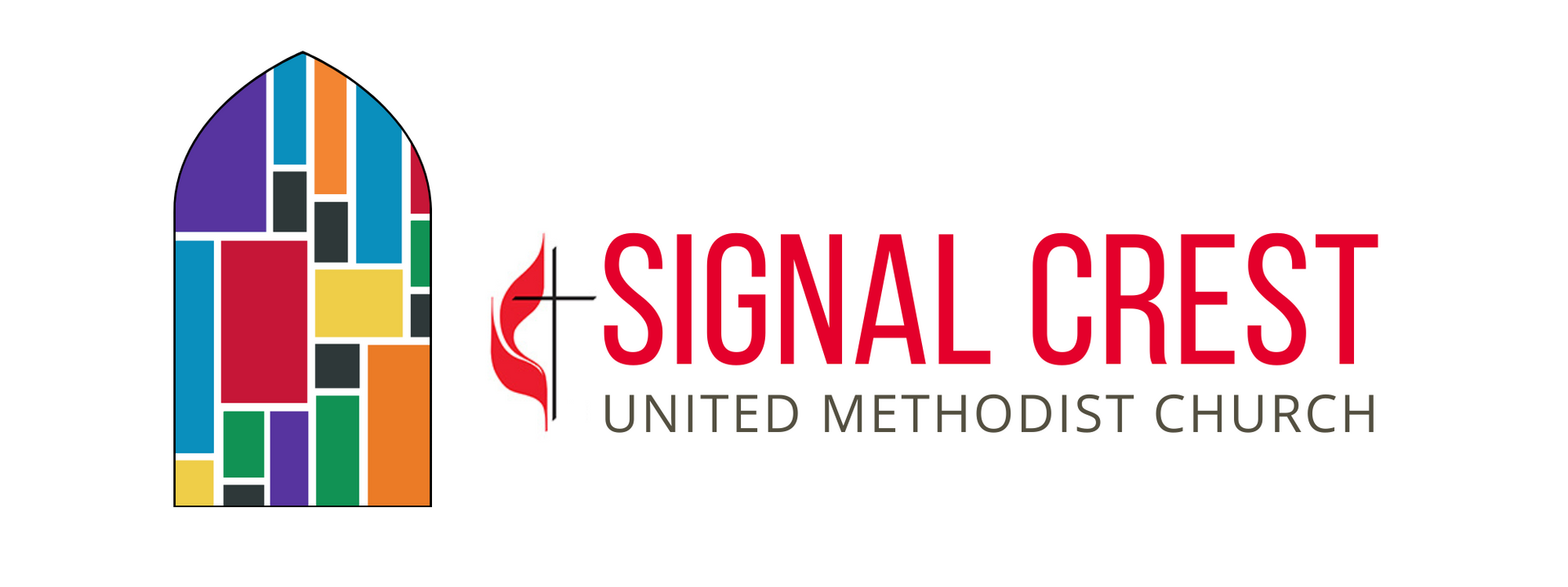
One of our Council members, Courtney Malone, was inspired to try her own hand at some designs, and she came up with some abstract concepts with mountaintops and other symbols. But none of the images really resonated with folks until she drew up some designs that incorporated the church’s stained-glass windows. At that point, nearly everyone who saw them felt we were on the right track. Nothing seems to say “Signal Crest” quite like our signature stained-glass windows.
We then explored some different designs – one that looked more like a family crest or shield, for example – but the design that captured the imaginations of the different folks we showed it to was the one that looked like a pointed window. It also seemed to suggest the upward lift of the sanctuary from some of the earlier designs. So that was the design that was finally presented to the Council.
I’m grateful for all those who created designs, suggested ideas, and offered responses. I’m also especially grateful for our youth, who ended up being one of our focus groups when they were hanging around the church in late June for their local mission week. Drew led them in a brainstorming session around some of the proposed logos, and they came up with some wording around how this church incorporates all kinds of differences in our congregation, just like the stained-glass windows have different colors, different sizes and shapes, but that what unites us all is the light of Christ that shines through our lives.
I thought that was just about right.
Signal Crest United Methodist Church
1005 Ridgeway Avenue
Signal Mountain, TN 37377
Phone: 423-886-2330
Fax: 423-886-6919